Grid and its all Properties
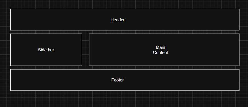
CSS Grid is a two-dimensional layout system in CSS that is used to arrange HTML elements into rows and columns simultaneously. It helps developers create structured responsive and complex web page layout easily.
Example of CSS Grid
Properties of Grid
display:grid;
The display property is used to define the layout behaviour of HTML element. When we set display:grid on a container it becomes a grid container and its direct child elements become grid items. It allows us to arrange items in rows and columns.
HTML File
<!DOCTYPE html>
<html lang="en">
<head>
    <meta charset="UTF-8">
    <meta name="viewport" content="width=device-width, initial-scale=1.0">
    <title>Document</title>
    <link rel="stylesheet" href="style.css">
</head>
<body>
 <div id="parent">
<div class="child child-1">1</div>
<div class="child child-2">2</div>
<div class="child child-3">3</div>
<div class="child child-4">4</div>
<div class="child child-5">5</div>

 </div>
</body>
</html>
CSS File
body{
    background-color: #121212;
    color: #fff;
}
#parent{
    border: 0.5px solid red;
    display: grid;
}
.child{
    border: 1px solid rgb(231, 127, 144);
    background-color: pink;
    color: black;
}
grid-template-rows;
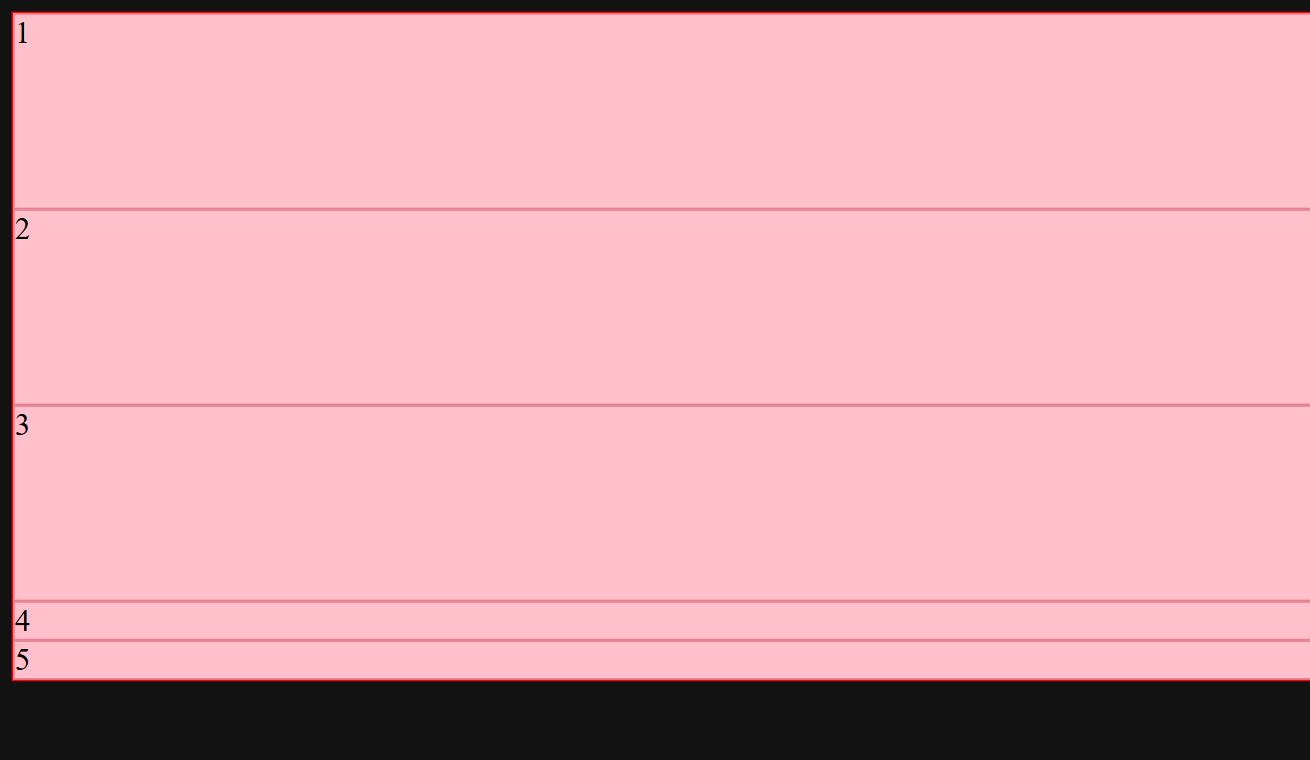
This property is used to define the no. of rows in a CSS Grid container and specify the height of each row.
CSS File
grid-template-rows: 100px 100px 100px;
Explanation
- Creates 3 rows
- Height of these 3 rows is 100px
Browser Preview
grid-template-columns;
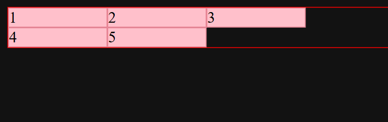
This is a CSS property in CSS Grid is used to define the number of columns in a grid container and specify the width of each column.
CSS File
grid-template-columns: 100px 100px 100px;
Explanation
- Creates 3 columns
- width of all columns is 100px
Browser Preview
Browser Preview After applying both properties together
CSS File
 grid-template-rows: 100px 100px 100px;
    grid-template-columns: 100px 100px 100px;
Browser Preview
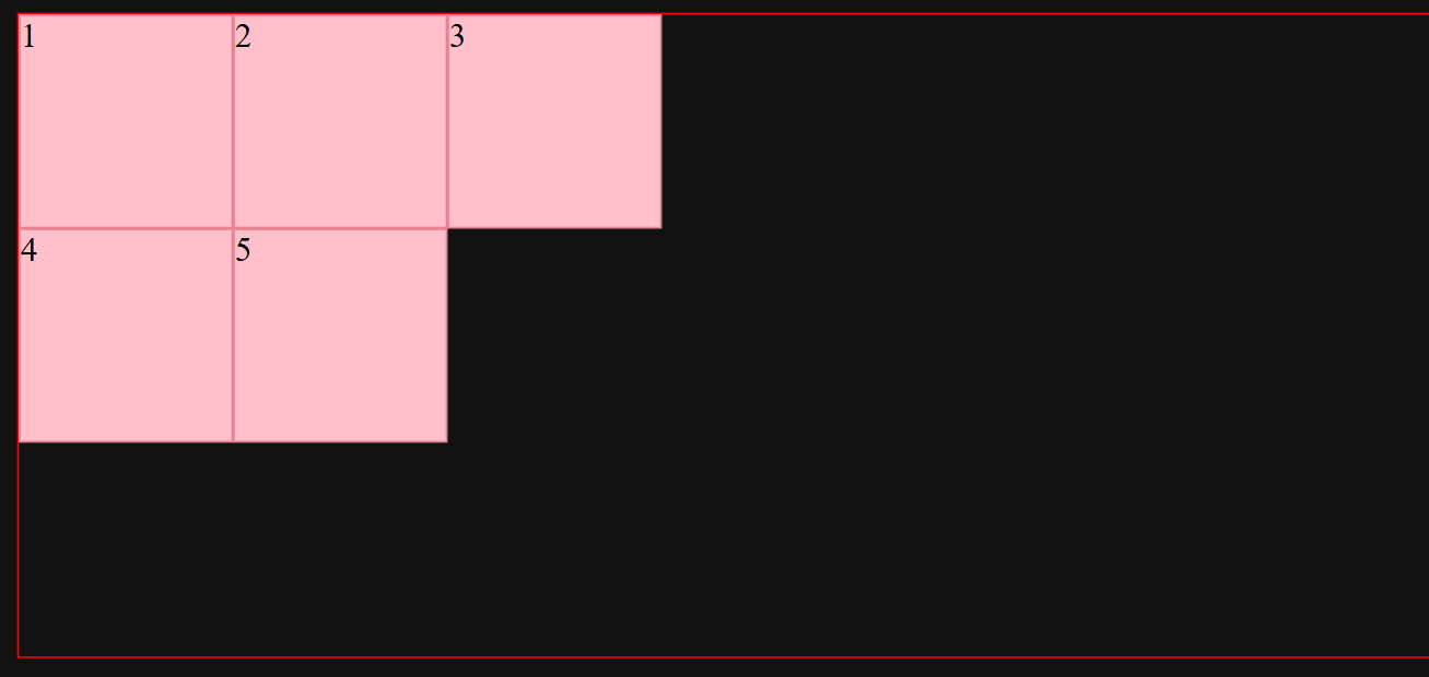
When you add next element it adds in a grid automatically according to given template.
HTML File
<!DOCTYPE html>
<html lang="en">
<head>
    <meta charset="UTF-8">
    <meta name="viewport" content="width=device-width, initial-scale=1.0">
    <title>Document</title>
    <link rel="stylesheet" href="style.css">
</head>
<body>
 <div id="parent">
<div class="child child-1">1</div>
<div class="child child-2">2</div>
<div class="child child-3">3</div>
<div class="child child-4">4</div>
<div class="child child-5">5</div>
<div class="child child-6">6</div>
<div class="child child-7">7</div>

 </div>
</body>
</html>
Browser Preview
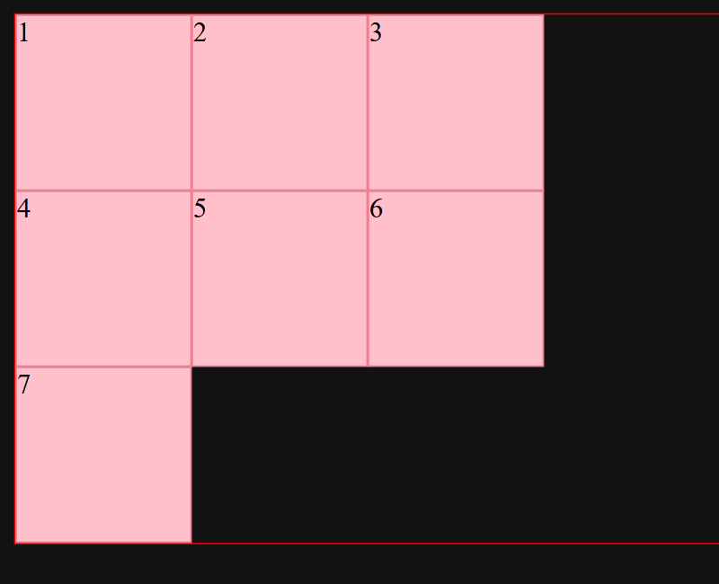
You can write these two properties using repeat() function.
repeat()function
The repeat() function in CSS Grid is used to repeat a specified number of rows or columns with the same size without writing the same value multiple times.
syntax
repeat(no_of_times , size)
no_of_times mean how many times the column or row should repeat.
size means the width of each column and height of each row.
CSS File
grid-template-rows: repeat(3,100px);
grid-template-columns: repeat(3,100px);/*It gives same output like previous*/
- what is
fr(Fraction)
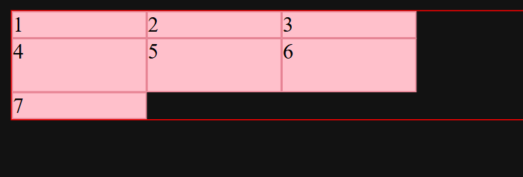
The fraction unit in CSS Grid represents a fraction of the available free space inside a grid container. It distributes a available space among grid rows and columns proportionally. Flexible according to available space.
CSS File
grid-template-rows: 1fr 2fr 1fr;
Browser Preview
- What is Pixels(
px)
A pixel is a CSS absolute-length unit used to define the fixed size of element such as its height, width, margin, padding and font size.Does not automatically adjust to available space.
gap
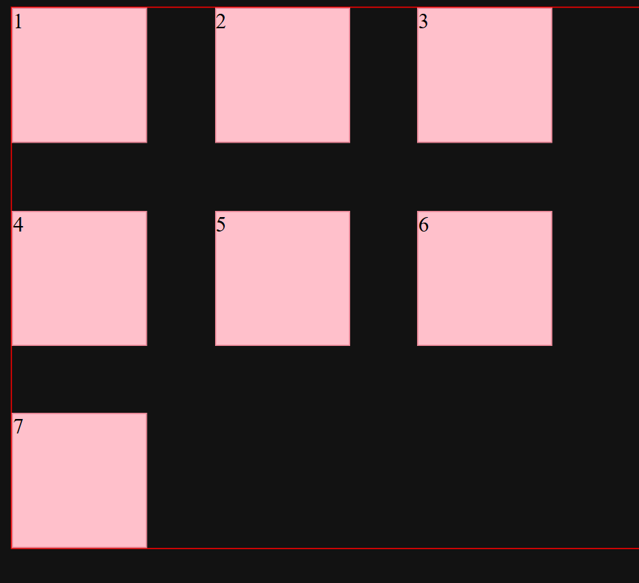
This property in css grid is used to create spacing between rows and columns inside a grid container. It controls the space between grid items without adding extra margin to individual elements.
CSS File
gap: 50px;
Browser Preview
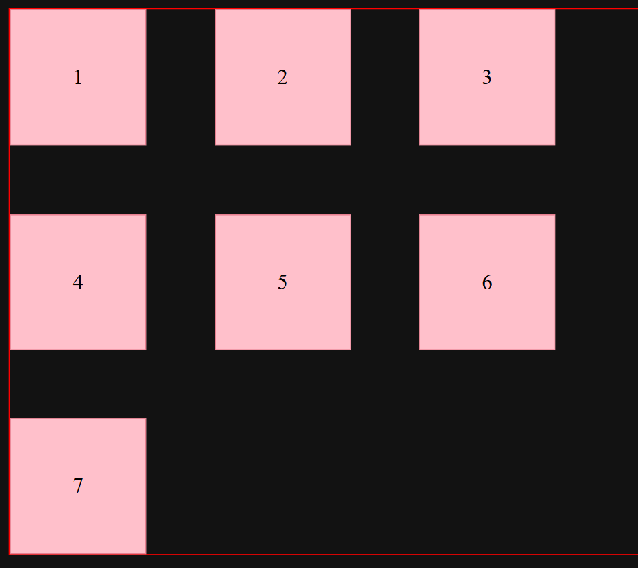
You can also use the flexbox's properties in grid.let's understand solving one problem. problem is i want to center the content(numbers) written inside the boxes
CSS File
.child{
    border: 1px solid rgb(231, 127, 144);
    background-color: pink;
    color: black;
    display: flex;
    justify-content: center;
    align-items: center;
}
Browser Preview
You can also place the items anywhere in the Grid using grid-row-start
grid-row-end , grid-column-start and grid-column-end
If you want the 6 number box to place in red box.
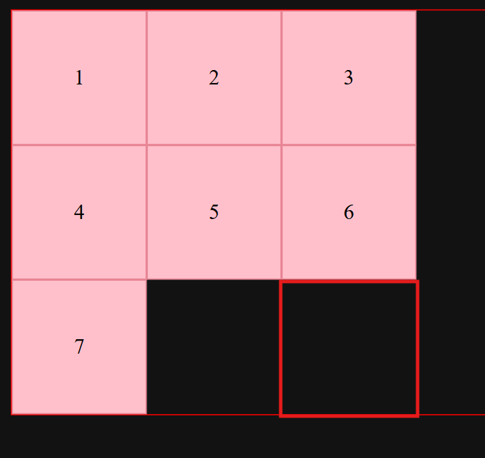
This is the way to use these 4 properties.
CSS File
.child-6{
    grid-row-start: 3;
    grid-row-end: 4;
    grid-column-start: 3;
    grid-column-end: 4;
}
Browser Preview
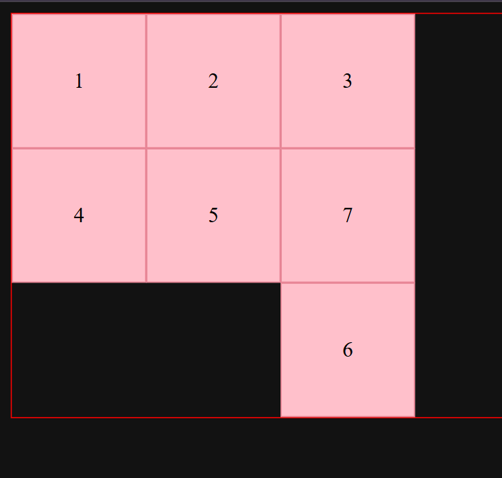
You can also use the negative numbers like -1, -2 in these 4 properties.if you add new columns in the grid element automatically placed in last column.grid-column-end:-1; grid-row-end:-1;
Shorthand way to write these properties
Syntax
grid-row : start / end
grid-column : start / end
grid-area : row-start / col-start / row-end / col-end
grid-template-areas
This property in CSS grid define names areas. It allows us to arrange grid items into specific rows and columns by assigning names to different sections of the layout.
HTML File
<!DOCTYPE html>
<html lang="en">
<head>
    <meta charset="UTF-8">
    <meta name="viewport" content="width=device-width, initial-scale=1.0">
    <title>Document</title>
    <link rel="stylesheet" href="style.css">
    <style>
        div{
            border: 2px solid red;
        }
        #parent{
            display: grid;
            gap: 10px;
            grid-template-areas:
            'header header header'
            'main main side'
            'footer footer footer'
            ;
        }
        .nav{
            grid-area: header;
        }
        .blog{
            grid-area: main;
        }
        .ads{
            grid-area: side;
        }
        .footer{
            grid-area: footer;
        }
    </style>
</head>
<body id="parent">
<div class="nav">Navbar</div>
<div class="blog">
    Lorem ipsum dolor sit amet consectetur adipisicing elit. Ratione voluptas nihil esse ex ullam, soluta impedit quas vitae aliquam repellat. Ipsam officiis repellendus placeat quia ipsum illum. Architecto, obcaecati. Accusantium.
    Dignissimos quod cupiditate consequuntur nobis modi perferendis distinctio quis error reprehenderit nesciunt sequi eum delectus possimus esse velit atque quia obcaecati quasi, harum sit. Repellat animi nemo maiores laborum hic.
</div>
 <div class="ads">This is for ads</div>
 <div class="footer">copyright 2026</div>
</body>
</html>
Browser Preview

Advantages of Grid
- Two-Dimensional Layout: Allows you to control rows and columns simultaneously.
- Easy Alignment: Makes it easy to align elements horizontally and vertically.
- Responsive Design: Helps create layouts that adjust to different screen sizes.
- Flexible Sizing: Supports units like
fr,%,px, and functions likerepeat(). - Less CSS Code: Reduces the need for complicated positioning and floating techniques.
- Layout Control: Allows you to control the position and size of grid items.
- Grid Template Areas: Makes it easier to design layouts using names like
header,sidebar,main, andfooter.
Disadvantages of Grid
- Learning Curve: Understanding grid lines, tracks, and areas can be difficult for beginners.
- Complex for Simple Layouts: It may be unnecessary for simple one-direction layouts where Flexbox is easier.
- Content Sizing Challenges: Sometimes, controlling item sizes according to their content requires additional CSS properties.
- Browser Compatibility: Some older browsers may not support all modern CSS Grid features.
- Nested Layouts: Complex nested grid structures can make CSS code harder to manage.
- One Layout System Is Not Always Enough: Some designs still need Flexbox or other CSS techniques alongside Grid.
Conclusion
CSS Grid is a powerful and flexible layout system that makes it easier to create structured and responsive web designs. Although it has some disadvantages, such as a learning curve, complex nested layouts, and occasional content-sizing challenges, its advantages make it very useful for modern web development. By understanding its properties and using it appropriately with Flexbox, developers can create clean, organized, and responsive website layouts efficiently.
Comments
Join the discussionNo comments yet. Be the first to comment.