Flexbox and its Properties
Flexbox(flexible box layout) is a CSS layout model used to arrange HTML elements in rows or columns and control their alignment, spacing and distribution. It is apply on Parent element & childrens are obey the parent.
Flexbox Main Axis and Cross Axis Diagram
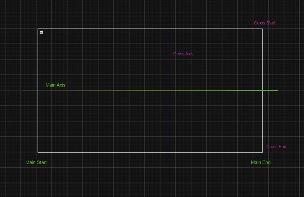
The diagram explains the Main Axis, Cross Axis, Main Start, Main End, Cross Start and Cross End in CSS Flexbox.
It is one of the most important concept to understand before learning justify-content and align-items.
- Understanding the Diagram
- Main Axis(Green Line): The Primary direction in ehich flex items are arranged.it's direction is from left to right.
- Cross Axis(Purple Line): The direction perpendicular to the main axis.it's direction is from top to bottom.
- Explanation of all six terms
| Term | Meaning |
|---|---|
| Main Axis | Direction in which flex items are arranged |
| Cross Axis | Direction perpendicular to the main axis |
| Main Start | Starting point of the main axis |
| Main End | Ending point of the main axis |
| Cross Start | Starting point of the cross axis |
| Cross End | Ending point of the cross axis |
Let discuss all the properties of of flexbox
display:flex
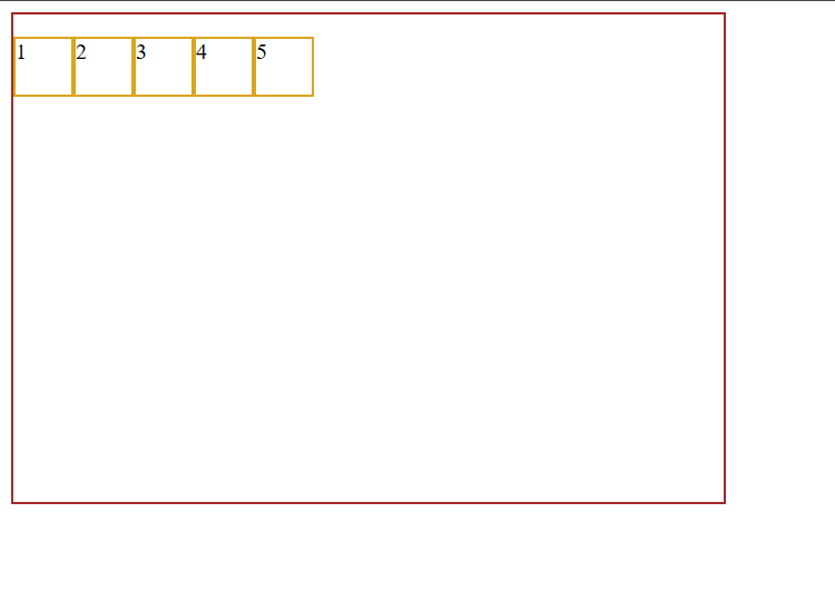
It is arrange all the childrens on the main axis from left to right. it activates flexbox on an element and makes it an flex container.
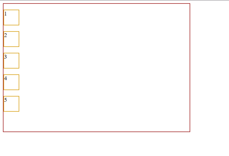
Before write display:flex
HTML File
<!DOCTYPE html>
<html lang="en">
<head>
    <meta charset="UTF-8">
    <meta name="viewport" content="width=device-width, initial-scale=1.0">
    <title>Document</title>
    <link rel="stylesheet" href="style.css">
</head>
<body>
 <div id="parent">
 <p class="child child-1">1</p>
 <p class="child child-2">2</p>
 <p class="child child-3">3</p>
 <p class="child child-4">4</p>
 <p class="child child-5">5</p>

 </div>
</body>
</html>
CSS File
#parent{
    border: 2px solid brown;
    width: 70vh;
    height: 350px;
}
.child{
    border: 2px solid goldenrod;
    height: 40px;
    width: 40px;
}
Browser Preview
After Writing display:flex
CSS File
#parent{
    border: 2px solid brown;
    width: 70vh;
    height: 350px;
}
.child{
    border: 2px solid goldenrod;
    height: 40px;
    width: 40px;
}
#parent{
     display: flex;
}
Browser Preview
flex-direction:row
it does not change output bu default this property is applied. it is align the item on main axis from left to right. it is specifies the direction in which flex items are arraanged.
- f
lex-direction:column
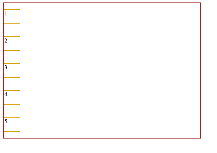
It is a CSS flecbox property that arranges flex items vertically from top to bottom along the main axis. it change the Main Axis top to bottom and cross axis Left to right.
CSS File
#parent{
    border: 2px solid brown;
    width: 70vh;
    height: 350px;
}
.child{
    border: 2px solid goldenrod;
    height: 40px;
    width: 40px;
}
#parent{
     display: flex;
     flex-direction: column;
}
Browser Preview
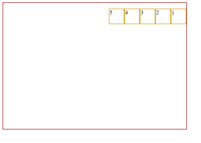
flex-direction:row-reverse
It is a CSS flexbox Property that arranges flex items horizontally in the reverse order from right to left.
CSS File
#parent{
    border: 2px solid brown;
    width: 70vh;
    height: 350px;
}
.child{
    border: 2px solid goldenrod;
    height: 40px;
    width: 40px;
}
#parent{
     display: flex;
     flex-direction:row-reverse;
}
Browser Preview
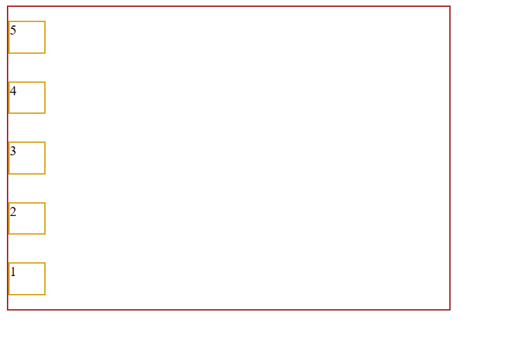
flex-direction:column-reverse
It is a CSS flexbox property that arranges flex items vertically in the reverse order bottom to top.
CSS File
#parent{
    border: 2px solid brown;
    width: 70vh;
    height: 350px;
}
.child{
    border: 2px solid goldenrod;
    height: 40px;
    width: 40px;
}
#parent{
     display: flex;
     flex-direction:column-reverse;
}
Browser Preview
justify-content: ;
It is a CSS flexbox property used to align and distribute flex items along the maina xis of a flex container.Flexbox alignment properties work along the Main Axis, and the direction of the main axis depends on the flex-direction property.
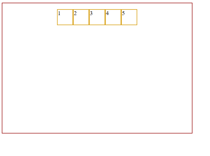
justify-content:center;
It is a CSS flexbox property that align flex items at the center of the flex container along the main axis.
CSS File
#parent{
    border: 2px solid brown;
    width: 70vh;
    height: 350px;
}
.child{
    border: 2px solid goldenrod;
    height: 40px;
    width: 40px;
}
#parent{
     display: flex;
    justify-content: center;
}
Browser Preview
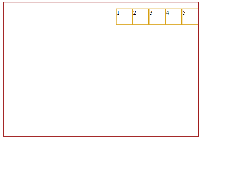
justify-content:end;
It is a flexbox property that positions flex items at the end of the main axis of the flex container.
CSS File
#parent{
    border: 2px solid brown;
    width: 70vh;
    height: 350px;
}
.child{
    border: 2px solid goldenrod;
    height: 40px;
    width: 40px;
}
#parent{
     display: flex;
    justify-content: end;
}
Browser Preview
justify-content:start;
It is a CSS flexbox property that positions the flex items at the start of the main axis of the flex container.
CSS File
#parent{
    border: 2px solid brown;
    width: 70vh;
    height: 350px;
}
.child{
    border: 2px solid goldenrod;
    height: 40px;
    width: 40px;
}
#parent{
     display: flex;
    justify-content: start;
}
Browser Preview
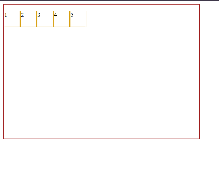
justify-content:space-around;
It is a CSS flexbox property that distributes flex items along the main axis by providing equal space around each item. The space at the beginning and end of the container is half the space between two adjacent items.
CSS File
#parent{
    border: 2px solid brown;
    width: 70vh;
    height: 350px;
}
.child{
    border: 2px solid goldenrod;
    height: 40px;
    width: 40px;
}
#parent{
     display: flex;
    justify-content: space-around;
}
Browser Preview
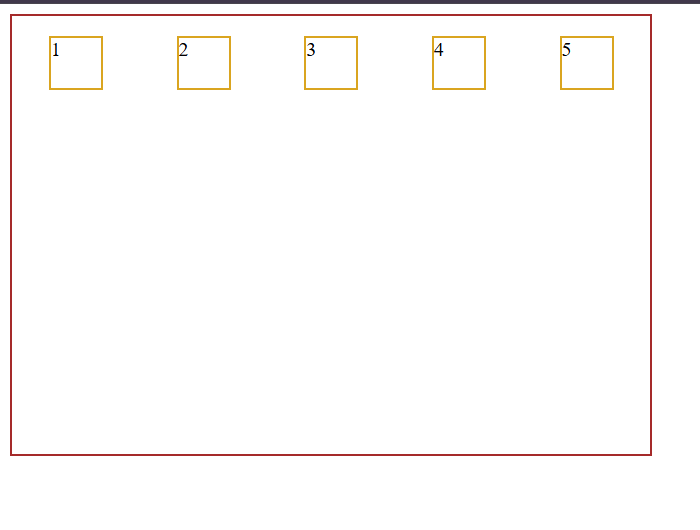
justify-content:space-between;
It is a CSS flexbox property that distributes flex items evenly along the main axis placing the first item at the beginning and the last item at the end with equal space between the items.
CSS File
#parent{
    border: 2px solid brown;
    width: 70vh;
    height: 350px;
}
.child{
    border: 2px solid goldenrod;
    height: 40px;
    width: 40px;
}
#parent{
     display: flex;
    justify-content: space-between;
}
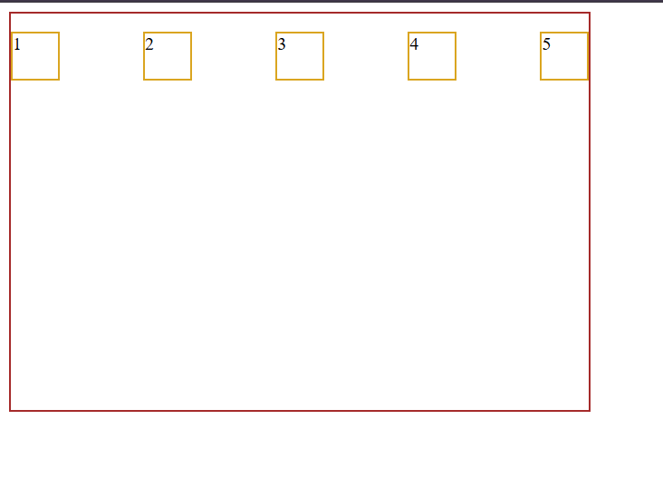
justify-content:space-evenly;
It is a CSS flexbox property that distributes flex items evenly along the main axis providing equal space between all items and at both end of containers.
CSS File
#parent{
    border: 2px solid brown;
    width: 70vh;
    height: 350px;
}
.child{
    border: 2px solid goldenrod;
    height: 40px;
    width: 40px;
}
#parent{
     display: flex;
    justify-content: space-evenly;
}
Browser Preview
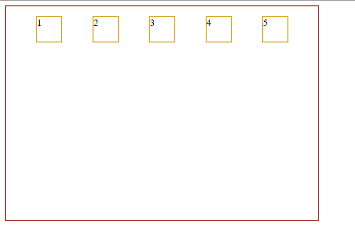
align-items: ;
It is the CSS flexbox property that arrange all the flex items along the cross axis.
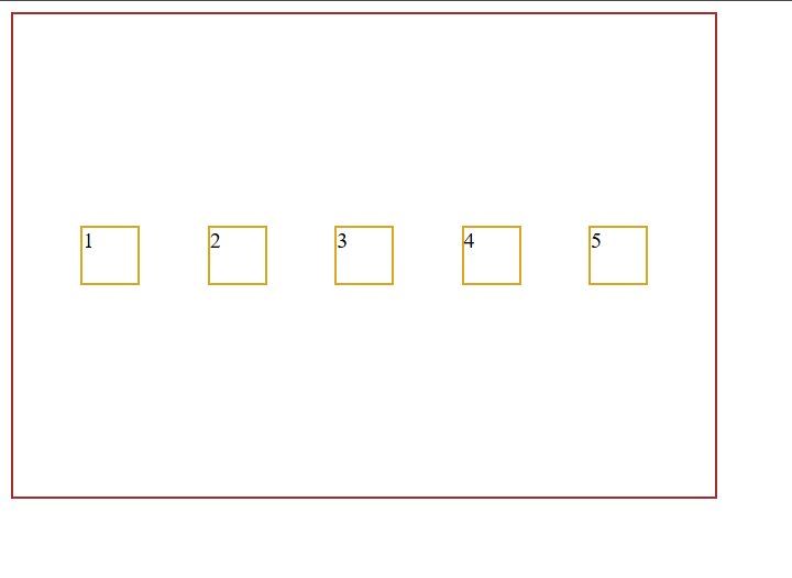
align-items:center;
It is a CSS flexbox property that aligns all the flex items at the center of the flex container along the cross axis.
CSS File
#parent{
    border: 2px solid brown;
    width: 70vh;
    height: 350px;
}
.child{
    border: 2px solid goldenrod;
    height: 40px;
    width: 40px;
}
#parent{
     display: flex;
    justify-content: space-evenly;
    align-items: center;
}
Browser Preview
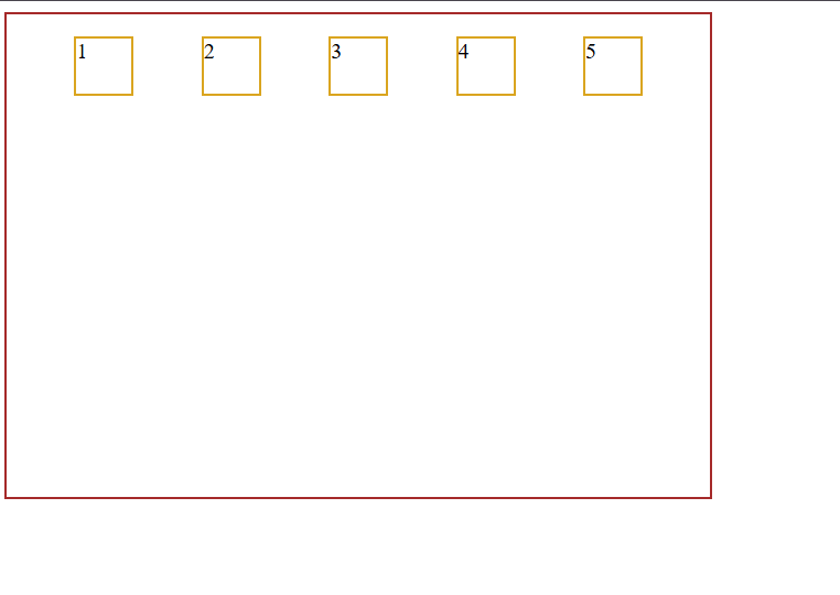
align-items:start;
It is a CSS flexbox property that aligns all the flex items at the start of the flex container along the cross axis.
CSS File
#parent{
    border: 2px solid brown;
    width: 70vh;
    height: 350px;
}
.child{
    border: 2px solid goldenrod;
    height: 40px;
    width: 40px;
}
#parent{
     display: flex;
    justify-content: space-evenly;
    align-items: start;
}
Browser Preview
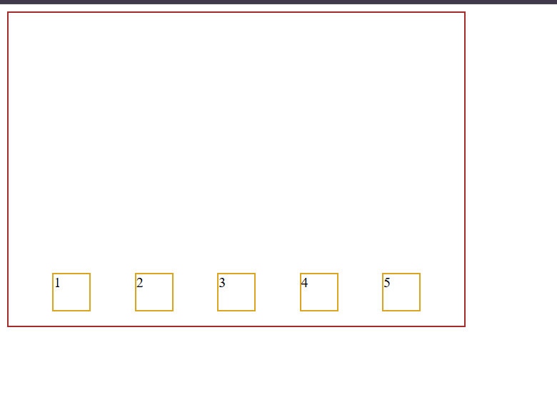
align-items:end;
It is a CSS flexbox property that aligns all the flex items at the end of the flex container along the cross axis.
CSS File
#parent{
    border: 2px solid brown;
    width: 70vh;
    height: 350px;
}
.child{
    border: 2px solid goldenrod;
    height: 40px;
    width: 40px;
}
#parent{
     display: flex;
    justify-content: space-evenly;
    align-items: end;
}
Browser Preview
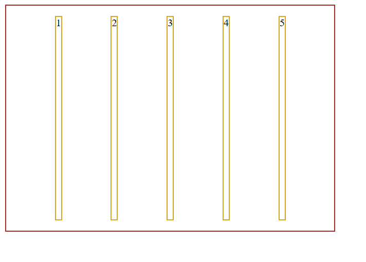
align-items:stretch;
It is a CSS flexbox property that stretches all flex items to fill the available space along the cross axis of the flex container provided their cross-axis size is not explicitly constrained.
CSS File
#parent{
    border: 2px solid brown;
    width: 70vh;
    height: 350px;
}
.child{
    border: 2px solid goldenrod;
    /* height: 40px;
    width: 40px; */
}
#parent{
     display: flex;
    justify-content: space-evenly;
    align-items: stretch;
}
Browser Preview
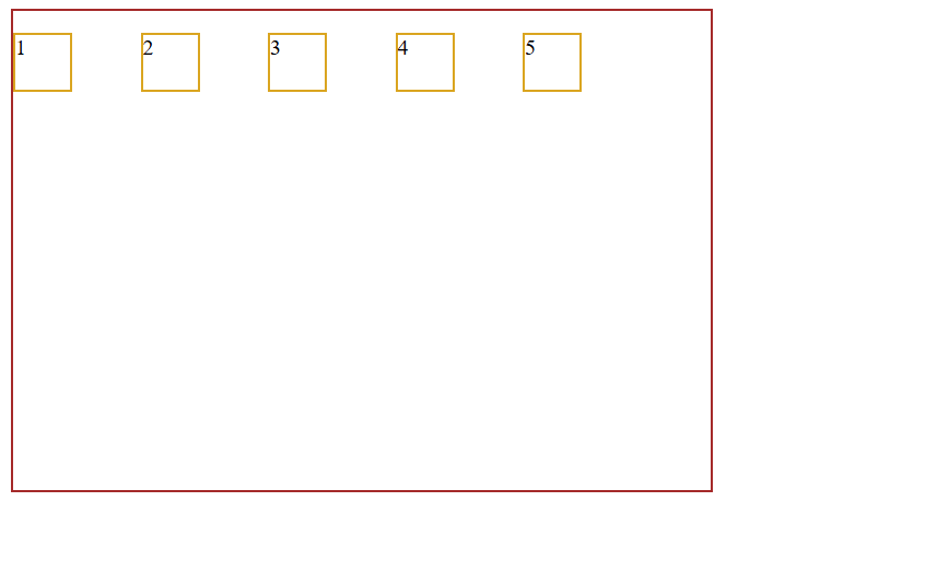
gap:50px;
It is a CSS flexbox property used to create 50 pixels of space between flex items inside a flex container.
CSS File
#parent{
    border: 2px solid brown;
    width: 70vh;
    height: 350px;
}
.child{
    border: 2px solid goldenrod;
    height: 40px;
    width: 40px;
}
#parent{
     display: flex;
    /* justify-content: space-evenly;
    align-items: stretch; */
    gap:50px;
}
Browser Preview
We have understand all the properties based on parent element till now. let discuss the properties which is work on child elements.
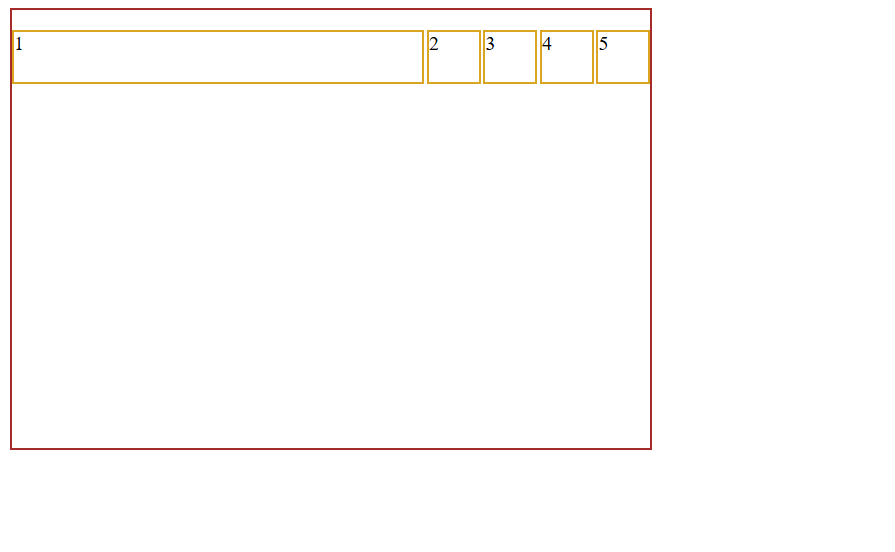
flex:1;
It is a css flexbox property applied to child element that allows it to grow and occupy the available free space inside the flex container
CSS File
#parent{
    border: 2px solid brown;
    width: 70vh;
    height: 350px;
}
.child{
    border: 2px solid goldenrod;
    height: 40px;
    width: 40px;
}
#parent{
     display: flex;
    justify-content: space-evenly;
    align-items: stretch;
    gap:2px;
}
.child-1{
    flex: 1;
}
Browser Preview
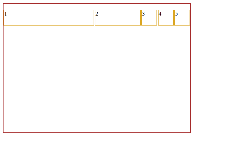
flex: 2andflex: 1
flex: 2allows an element to take twice the available space compared to an element withflex: 1.flex: 1allows an element to take one share of the available space.
CSS File
.child-1{
    flex: 2;
}
.child-2{
    flex: 1;
}
Browser Preview
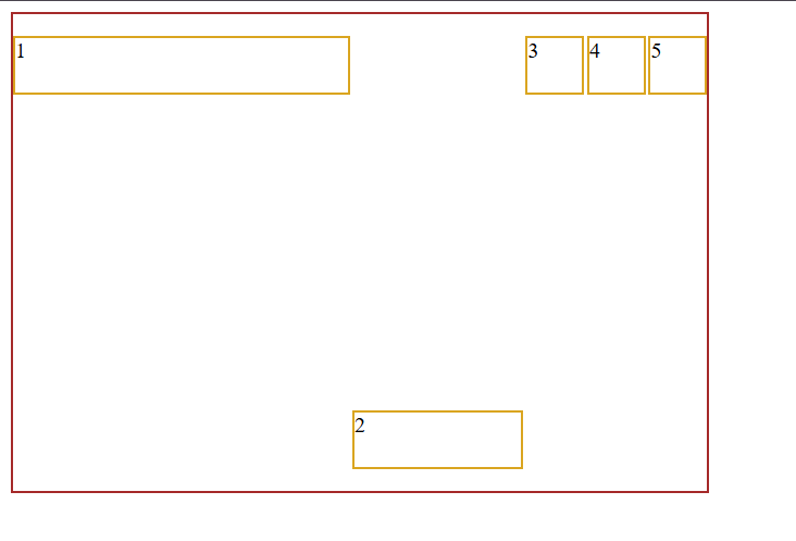
align-self:end;
It is a CSS flexbox property applied to an individual child element positions it to at the end of the cross axis overriding the alignment specified by the parent's align-items property.
CSS File
.child-1{
    flex: 2;
}
.child-2{
    flex: 1;
    align-self: end;
}
Browser Preview
Order: ;
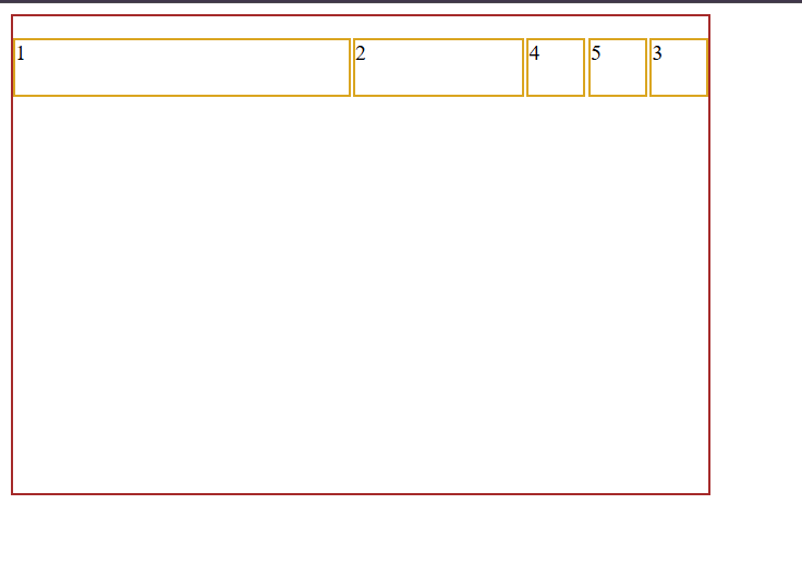
The order property is a CSS flexbox property applied to child elements to change their visual display order inside a flex container without changing the actual order of elements in the HTML document. It work based on Priority.
By default all the element have the 0 Priority.
CSS File
.child-1{
    flex: 2;
}
.child-2{
    flex: 1;
    /* align-self: end; */
}
.child-3{
    order:2;
}
Browser Preview
Let understand it with the help of diagram how it is change the order
Diagram
Bye default priority of all element is Zero
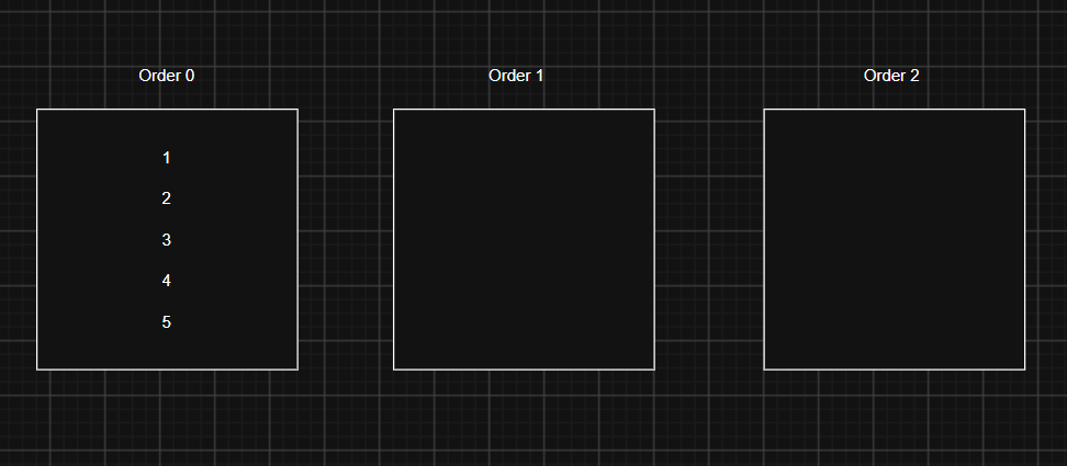
After set the Order property 2 on child 3
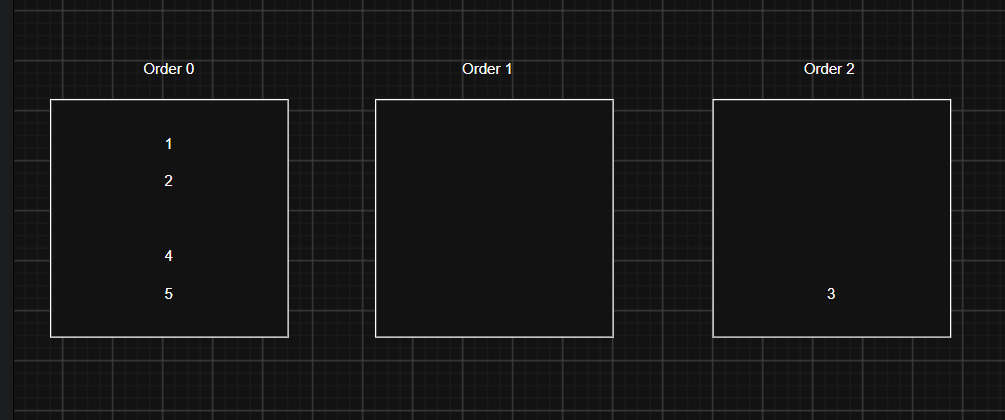
It scan firstly Order 0 Bucket then Order 1 and Order 2 bucket. Now the displaying order of flex items is:
1,2,4,5,3
Advantages of Flexbox
- Easy Alignment: Easily align elements horizontally and vertically using
justify-contentandalign-items. - Flexible Layout: Items can automatically adjust their sizes according to the available space.
- Space Distribution: Distribute space between elements using properties like
space-between,space-around, andspace-evenly. - Responsive Design: Helps create layouts that adjust to different screen sizes.
- Easy Reordering: Change the visual order of elements using the
orderproperty without changing the HTML structure. - Less CSS Code: Reduces the need for complicated positioning and floating techniques.
- Gap Support: Easily add consistent spacing between items using the
gapproperty.
Disadvantages of Flexbox
- One-Dimensional Layout: Flexbox is mainly designed to work in one direction at a time—row or column.
- Not Ideal for Complex Layouts: It can be difficult to create complex two-dimensional layouts involving rows and columns.
- Unexpected Sizing: Flex items may shrink or grow automatically, which can sometimes produce unexpected results.
- Alignment Can Be Confusing: Understanding the main axis and cross axis can be difficult for beginners.
- Visual Order vs HTML Order: Changing the visual order using
orderdoes not change the actual HTML or keyboard navigation order.
Comments
Join the discussionNo comments yet. Be the first to comment.