CSS Box Model & Display Property
What is CSS Box Model
The CSS Box Model is a fundamental CSS concept that describes how every HTML element is represented as a rectangular box. it consists of four parts: Content Padding Border and Margin.
It helps us control the size, spacing and layout of HTML elements on a webpage.
Diagram
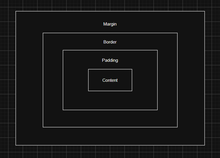
Let discuss all the parts one by one
- Content
- The actual text, image or other content inside a element.
widthandheightgenerally control the content area by default.
Browser Preview
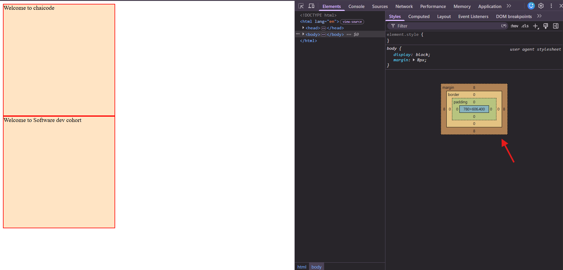
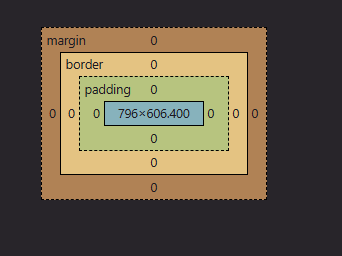
You can see in the Browser Preview Picture here width and height of the content is the by default. Margin is also by default you can change it with the help of universal selector. let see
CSS File
 *{
    margin: 0;
    padding:0;
 }
Browser Preview
- Padding
- The space between content and the border.
- Create inner spacing around the content.
Here we set the padding 20px.
CSS File
 .box{
    border: 2px solid red;
    background-color: bisque;
    height: 300px;
    width: 300px;
    padding:20px;
 }
Browser Preview
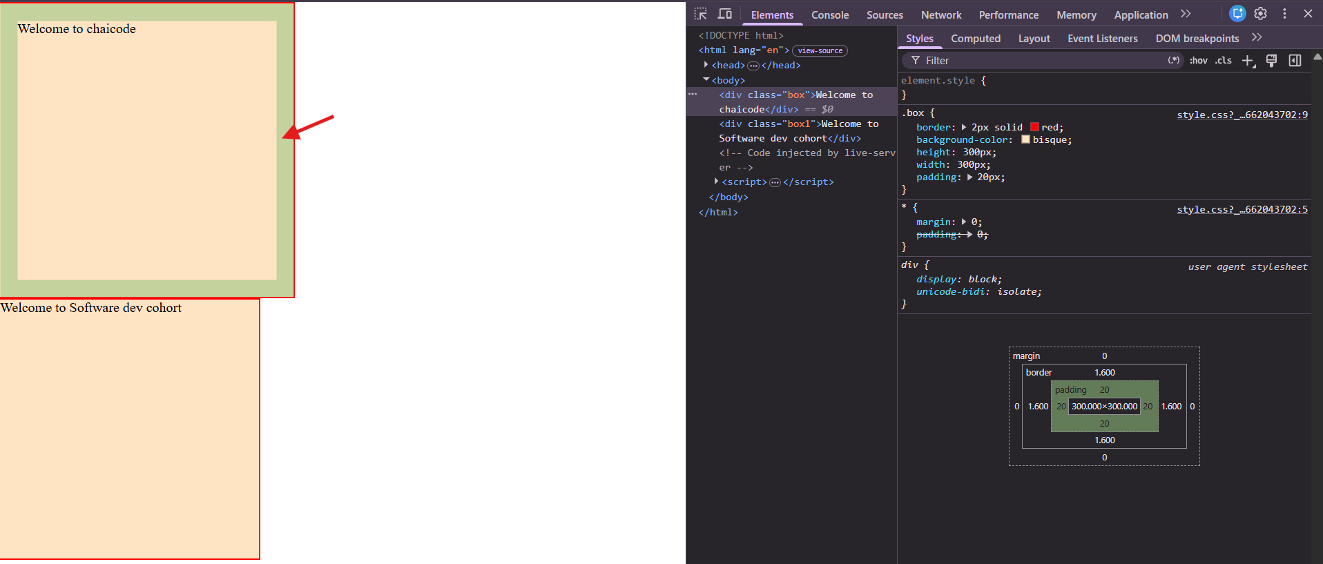
In this picture arrow shows the padding area.
You can also give specific padding using padding-top padding-bottom padding-right padding-left properties.
Syntax of shorthand notation is:
padding : top / right / bottom / left
- Border
- The boundary surrounding the content and padding
- Create inner spacing around the content.
Here we set border 20px
CSS File
.box{
    border: 20px solid red;
    background-color: bisque;
    height: 300px;
    width: 300px;
    padding:20px;
 }
Browser Preview
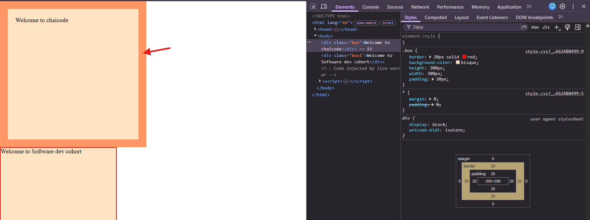
This arrow shows the border area.
- Margin
- The space outside the border.
- Creates distance between an element and other elements.
Here we set the margin 20px.
CSS File
 .box{
    border: 2px solid red;
    background-color: bisque;
    height: 300px;
    width: 300px;
    margin: 20px;
    padding:20px;
 }
Browser Preview
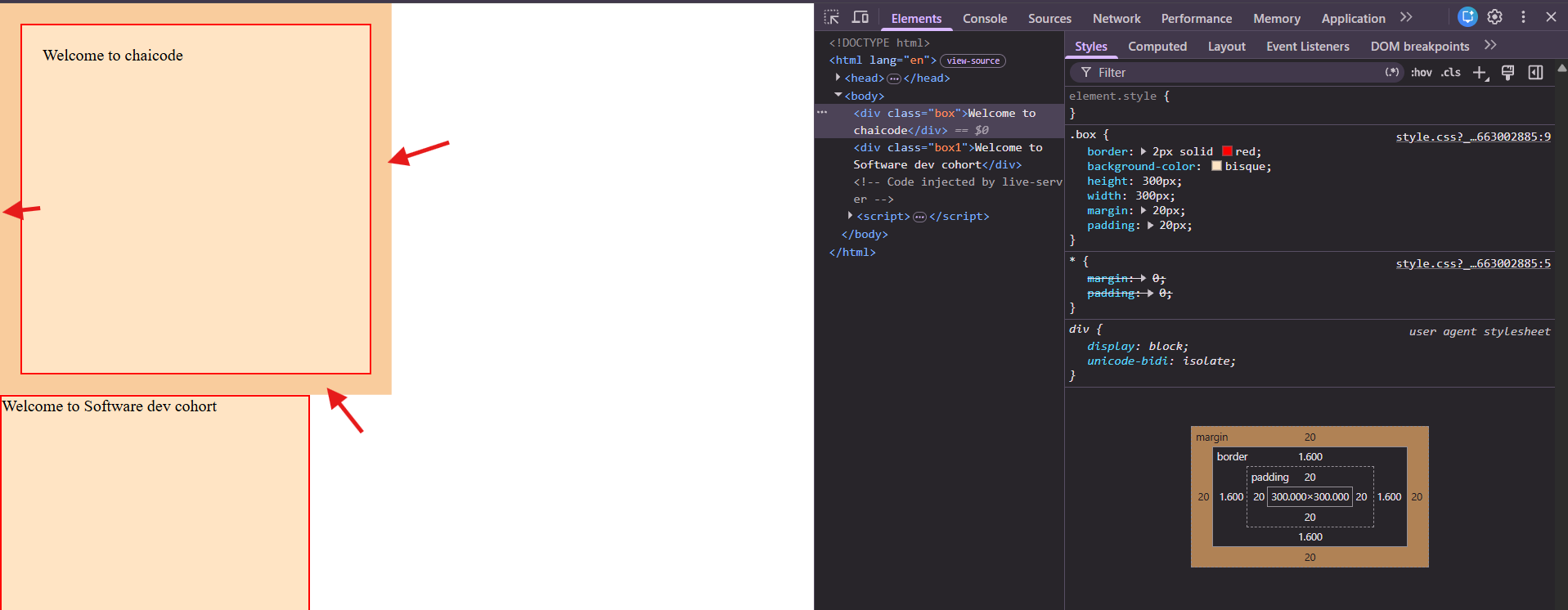
You can also give specific margin using margin-top margin-bottom margin-right margin-left properties.
Syntax of shorthand notation is:
margin : top / right / bottom / left
| Values | Applied sides |
|---|---|
| 1 value | All four sides |
| 2 values | Top & Bottom , Left & Right |
| 3 values | Top , Left & Right , Bottom |
| 4 values | Top , Right , Bottom , Left |
Shorthand notation is exactly the same for both margin and padding
Display Property
What is Block Level Element
A block-level element is an HTML element that starts on a new line and occupies the full available width of its parent container by default even if its content does not require that much space.
HTML File
<!DOCTYPE html>
<html lang="en">
<head>
    <meta charset="UTF-8">
    <meta name="viewport" content="width=device-width, initial-scale=1.0">
    <title>Document</title>
    <link rel="stylesheet" href="style.css">
</head>
<body>
<div>Welcome to chaicode</div>
<div>Software dev Cohort</div>


</body>
</html>
CSS File
div{
    border: 2px solid red;
    background-color: bisque;
    height: 50px;
    width:600px;
 }
Browser Preview

- It respect the given custom height and width
CSS File
div{
    border: 2px solid red;
    background-color: bisque;
    height: 50px;
    width:600px;
 }
Browser Preview
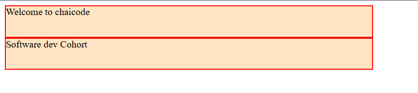
- It also respect the given custom margin and padding.
CSS File
 div{
    border: 2px solid red;
    background-color: bisque;
    height: 50px;
    width:600px;
    margin: 25px;
    padding: 50px;
 }
Browser Preview
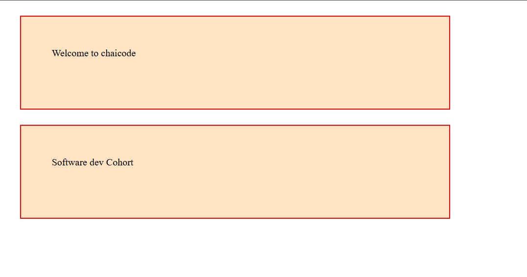
Some commonly used block-level elements are:
<div><p><h1> to <h6><section><header><footer><article><ul><ol><li>
What is Inline elements
Inline elements are HTML elements that do not start on a new line. They occupy only as much horizontal width as their content requires and allow other elements to appear alongside them on the same line.
HTML File
<!DOCTYPE html>
<html lang="en">
<head>
    <meta charset="UTF-8">
    <meta name="viewport" content="width=device-width, initial-scale=1.0">
    <title>Document</title>
    <link rel="stylesheet" href="style.css">
</head>
<body>
<span>Welcome to chaicode</span>
<span>Software dev cohort</span>
</body>
</html>
CSS File
span{
    border: 2px solid red;
    background-color: bisque;
    height: 150px;
    width:400px;
 }
Browser Preview
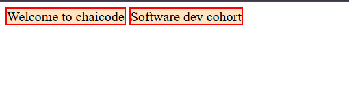
It does not respect the custom height and width.
CSS File
span{
    border: 2px solid red;
    background-color: bisque;
    height: 150px;
    width:400px;
 }
Browser Preview
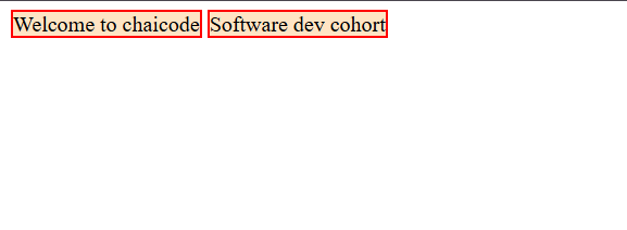
It did not change the height and width.
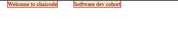
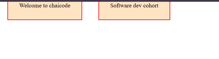
It apply only horizontal margin not vertically. But padding you can apply.
CSS File
span{
    border: 2px solid red;
    background-color: bisque;
    margin: 20px;
    height: 150px;
    width:400px;
 }
Browser Preview
CSS File
span{
    border: 2px solid red;
    background-color: bisque;
    margin: 20px;
    padding: 30px;
    height: 150px;
    width:400px;
 }
Browser Preview of padding
Some commonly used inline elements are:
<span><a><strong><b><i><em><img><label>
What is display Property
This property in CSS is used to define how an HTML element is displayed on webpage and how it behaves in the layout. It controls whether an element behaves as a block, inline, flex container, grid container or other display type. like display:inline display:block display:inline-block
inline-block behaves like an inline but you can add custom height width margin padding.
box-sizing:border-box property
This property tells the browser to include an element's content , padding and border within its specified width and height.
Let check box size without applying this property and padding
CSS File
*{
    margin: 0;
    padding:0;
}
 .box{
    border: 2px solid red;
    background-color: bisque;
    height: 150px;
    width:400px;
 }
Browser Preview
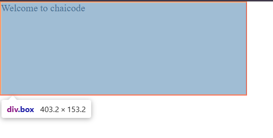
Box Size is 403 x 153.2
Now check the size of box using padding
CSS File
 .box{
    border: 2px solid red;
    background-color: bisque;
    padding: 20px;
    height: 150px;
    width:400px;
 }
Browser Preview
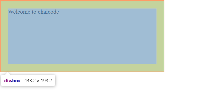
Box Size is Increased.
now check the difference using box-sizing and padding together
CSS File
 .box{
    border: 2px solid red;
    background-color: bisque;
    box-sizing: border-box;
    padding: 20px;
    height: 150px;
    width:400px;
 }
Browser Preview
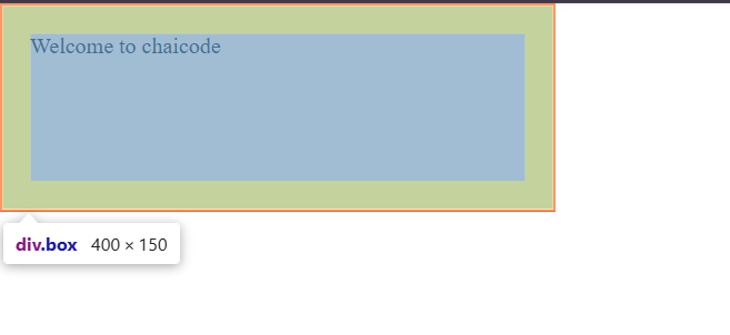
now check it does not increase the box size. It include content in specified height and width.
Conclusion
The CSS Box Model is an important concept in web development that helps us understand how HTML elements are sized, spaced, and positioned on a webpage. It consists of four main components: Content, Padding, Border, and Margin. We also learned about block-level and inline elements, the display property, and how box-sizing: border-box helps control the overall dimensions of an element. Understanding these concepts makes it easier to create well-structured layouts, manage spacing, and design responsive websites efficiently.
Comments
Join the discussionNo comments yet. Be the first to comment.