CSS Position and Units
What is Position Property
This property in CSS is used to to control how an HTML element is positioned on a webpage. It determines how an element is placed relative to its normal position , its parent element or the browser viewport.
There are 5 Position properties
- Static
- Relative
- Absolute
- Fixed
- Sticky
Let discuss it one by one
position:static
The static value is the default positioning of every HTML element. Elements follow the normal document flow and top bottom right and left do not affect their position.
position:relative
The relative value positions an element relative to its original position in the normal document flow. You can move it using top right bottom and left.
CSS File
.image2{
    position: relative;
    top: 100px;
}
The element moves 100px down. Its original space remains reserved. You can also use bottom left and right like top.
Browser Preview

position:absolute
The absolute value positions an element relative to its nearest positioned ancestor(an ancestor whose position is not static) It is removed from the normal document flow.You can move it using top right bottom and left.
It do not reserve the original space.
CSS File
div{
    border: 1px solid black;
    position:relative
}
.image2{
   position: absolute;
     top: 300px;
}
Browser Preview

position:fixed
The fixed value positions an element relative to the browser viewport. It stays in the same position even when the page is scrolled.You can move it using top right bottom and left. it do not reserve the original space. It initial output is same like absolute value.
Example: A floating button that stays at the bottom right corner of the screen.
CSS File
div{
    border: 1px solid black;
    height:1800px;

}
.image2{
   position:fixed;
     top: 300px;

}
Browser Preview

It's real effect is show when we are scrolling the page.
position:sticky
The sticky value allows an element to behave like a normal element initially but it sticks to a specified position when the user scrolls to a particular point. It reserve the original space.You can move it using top right bottom and left.
Example : A navigation bar that sticks to the top of the page while scrolling.
CSS File
div{
    border: 1px solid black;
    height:1800px;

}
.image2{
   position:sticky;
     top: 300px;

}
.image4{
    position: fixed;
}
Browser Preview

We have created two divs. The element with position: sticky will remain stuck only until the first div (its parent container) ends, whereas the element with position: fixed will remain fixed in the same position even when we scroll into the second div.
CSS Size Unit
What is Size Unit
CSS Size units are used to define the dimensions , spacing and positioning of HTML elements. They specify values such as width height margin padding font-size .
CSS units are mainly divided into two categories
- Absolute Units
- Relative Units
1. Absolute Units
Absolute units represent fixed measurements that do not depend on the size of another element or its parent. e.g pixels(px)
What is px
Pixel (px) is an absolute CSS length unit used to define the size of HTML elements, such as width, height, margin, padding, and font size. It represents a specific CSS measurement that does not automatically change according to the size of its parent element or viewport.
Difference between Physical pixels and logical pixels
Physical Pixels
Physical pixels are the actual tiny dots of light present on device's display screen. They represent the hardware resolution of the screen.
For example a display with resolution of 1920 x 1080 has
- 1920 physical pixels in width
- 1080 phusical pixels in height
Logical Pixels
Logical pixels are units used by software and browsers to define the size and positions of elements on the screen. They are also called CSS pixels in web development.
.box {
    width: 100px;
    height: 100px;
}
Difference between PPI and DPI
PPI(Pixels per inch)
PPI stands for pixels per inch. It measures the pixels density of a digital display , indicating how many pixels are packed into one inch of screen.
- Higher PPI means more pixels are packed into each inch
- Higher PPI generally produce sharper and more detailed images.
Example : A display with 300 PPI has 300 Pixels per inch.
DPI(Dots per inch)
DPI stands for Dots per inch. It measures how many physical ink dots a printer can produce in one inch.
- Higher DPI means generally more detailed printing.
- It is commonly used to describe printer resolution.
Example : A Printer with 600 DPI can print up to 600 ink dots per inch.
HTML File
<!DOCTYPE html>
<html lang="en">
<head>
    <meta charset="UTF-8">
    <meta name="viewport" content="width=device-width, initial-scale=1.0">
    <title>Document</title>
    <link rel="stylesheet" href="style.css">
</head>
<body>
<div class="box">Welcome to Chaicode</div>
</body>
</html>
CSS File
.box{
   border: 2px solid black;
   font-size: 50px;
}
Browser Preview

2. Relative units
Relative units define sizes based on another value, such as the parent element's size, root element size, or viewport dimensions. e.g em rem % vw vh
What is em
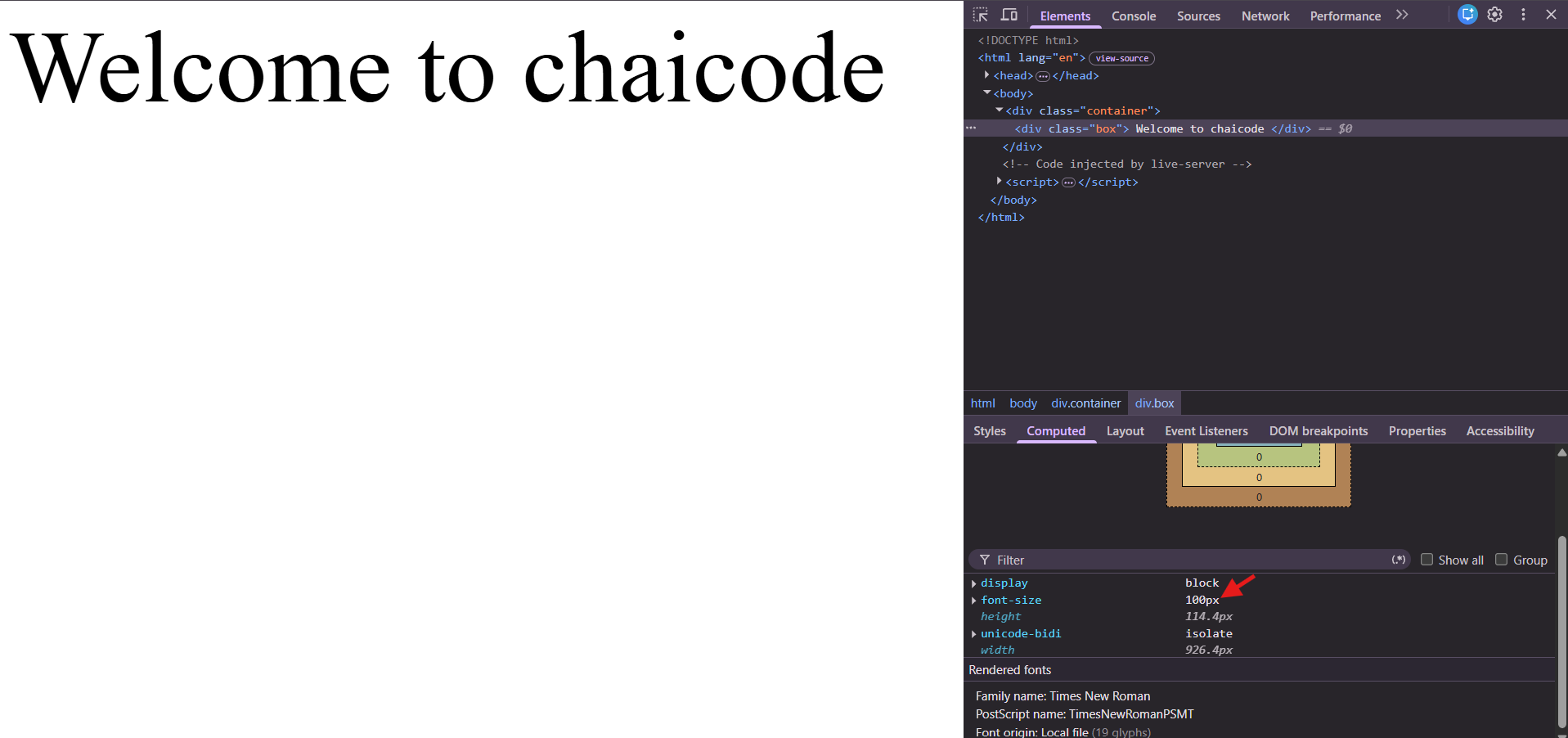
The em is a relative CSS length unit used to define the size of elements based on the font size of their parent element. It is commonly used for setting font size, margin, padding, and other dimensions.
HTML File
<!DOCTYPE html>
<html lang="en">
<head>
    <meta charset="UTF-8">
    <meta name="viewport" content="width=device-width, initial-scale=1.0">
    <title>Document</title>
    <link rel="stylesheet" href="style.css">
</head>
<body>
<div class="container">
    <div class="box">
        Welcome to chaicode
    </div>
</div>
</body>
</html>
CSS File
.container{
    font-size: 10px;
}
.box{
 font-size: 10em;
}
parent element's size is multiply by chaild's element size so the result is 10 x 10=100px
Browser Preview
What is rem
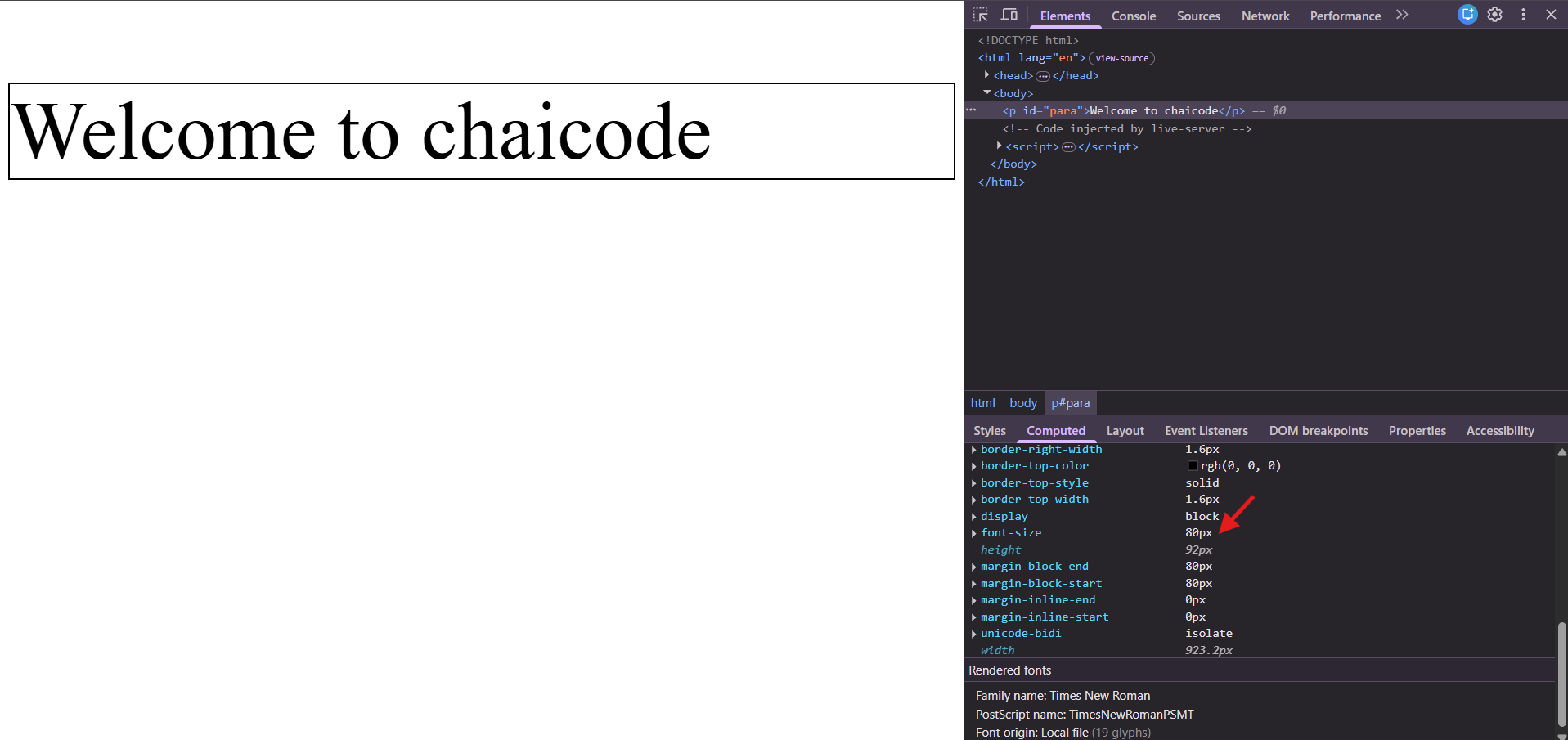
rem (Root Em) is a relative CSS length unit that is based on the font size of the root element (html). By default, most browsers set the root font size to 16px.
CSS File
#para{
    border: 2px solid black;
    font-size: 5rem;
}
Browser Preview
What is %
% is a relative CSS length unit that defines the size of an element based on the size of its parent element or another reference value, depending on the CSS property being used.
HTML File
<!DOCTYPE html>
<html lang="en">
<head>
    <meta charset="UTF-8">
    <meta name="viewport" content="width=device-width, initial-scale=1.0">
    <title>Document</title>
    <link rel="stylesheet" href="style.css">
</head>
<body>
<div class="parent">
    <div class="child">child</div>
</div>
</body>
</html>
CSS File
.parent{
    border: 2px solid black;
    background-color: beige;
}
.child{
    border: 2px solid green;
    background-color: aqua;
    width: 50%;
}
Browser Preview

What is vh and vw
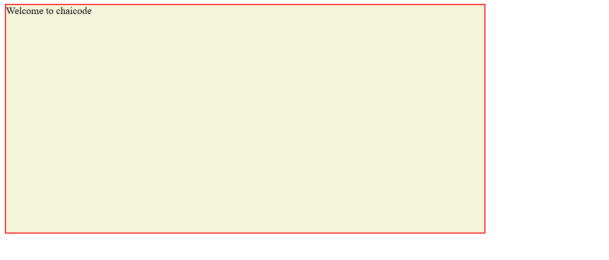
vh is a relative CSS unit that represents a percentage of the browser's viewport height. 1vh is equal to 1% of the viewport height.
vw is a relative CSS unit that represents a percentage of the browser's viewport width. 1vw is equal to 1% of the viewport width.
CSS File
.box{
    border: 2px solid red;
    background-color: beige;
    height: 50vh;
    width: 50vw;
}
Browser Preview
Comments
Join the discussionNo comments yet. Be the first to comment.